CoolCrate is a mobile app concept designed to help households reduce food waste through smarter fridge and pantry management. I led a team of 4 designers through a full 10-week design cycle — from research and ideation to high-fidelity prototyping and usability testing.
-
As team lead, I established our project timeline, facilitated weekly feedback sessions, and created onboarding resources including persona templates, competitive analysis frameworks, and styling guidelines to align the team before design work began. I also owned the pantry feature end-to-end across all fidelity stages.
-
This was a quarter long project assigned by Dr. Stacy Branham in Informatics 132.
-
I wanted to keep refining my knowledge with Figma and these tools were the most commonly used amongst our group.
The Problem
Millions of households struggle to track what's in their fridge, leading to food spoilage, wasted money, and poor meal planning. We set out to design a solution that goes beyond basic expiration reminders — one that supports shared households, surfaces recipes for expiring items, and makes everyday fridge management feel effortless.

The Solution
Thus, CoolCrate was born. Scroll down below to see how we got here ⬇️
User Research
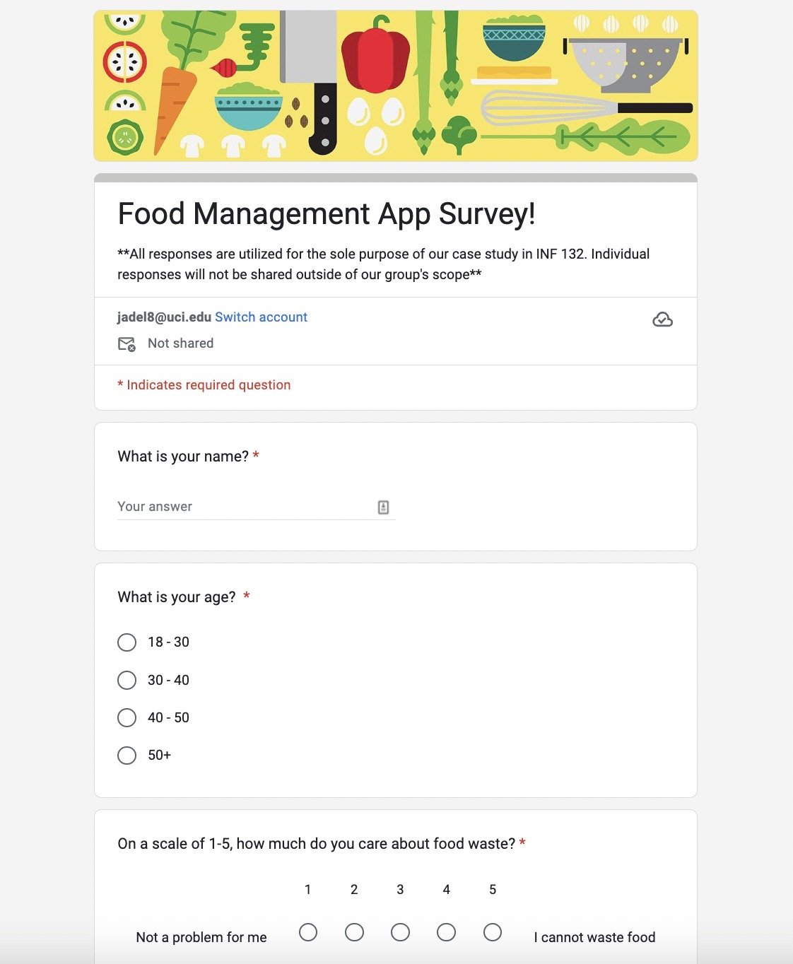
To ground our design decisions in real behavior, I created and distributed a user research survey targeting adults ages 18–30 as they were the most available population within the UCI community pool. With responses collected across our team, we found that over 56% of respondents struggled to track their food products' lifespan despite caring about reducing waste. These insights directly shaped our core feature set, including specialized features that prospective users could benefit from such as:
the ability to customize name labels for products (especially useful for lesser known ethnic products in the U.S.)
the option to choose which reminders (use by, expiring, time span specific) users would like to enable
easily accessible features to input products into one’s household log with a barcode scanner
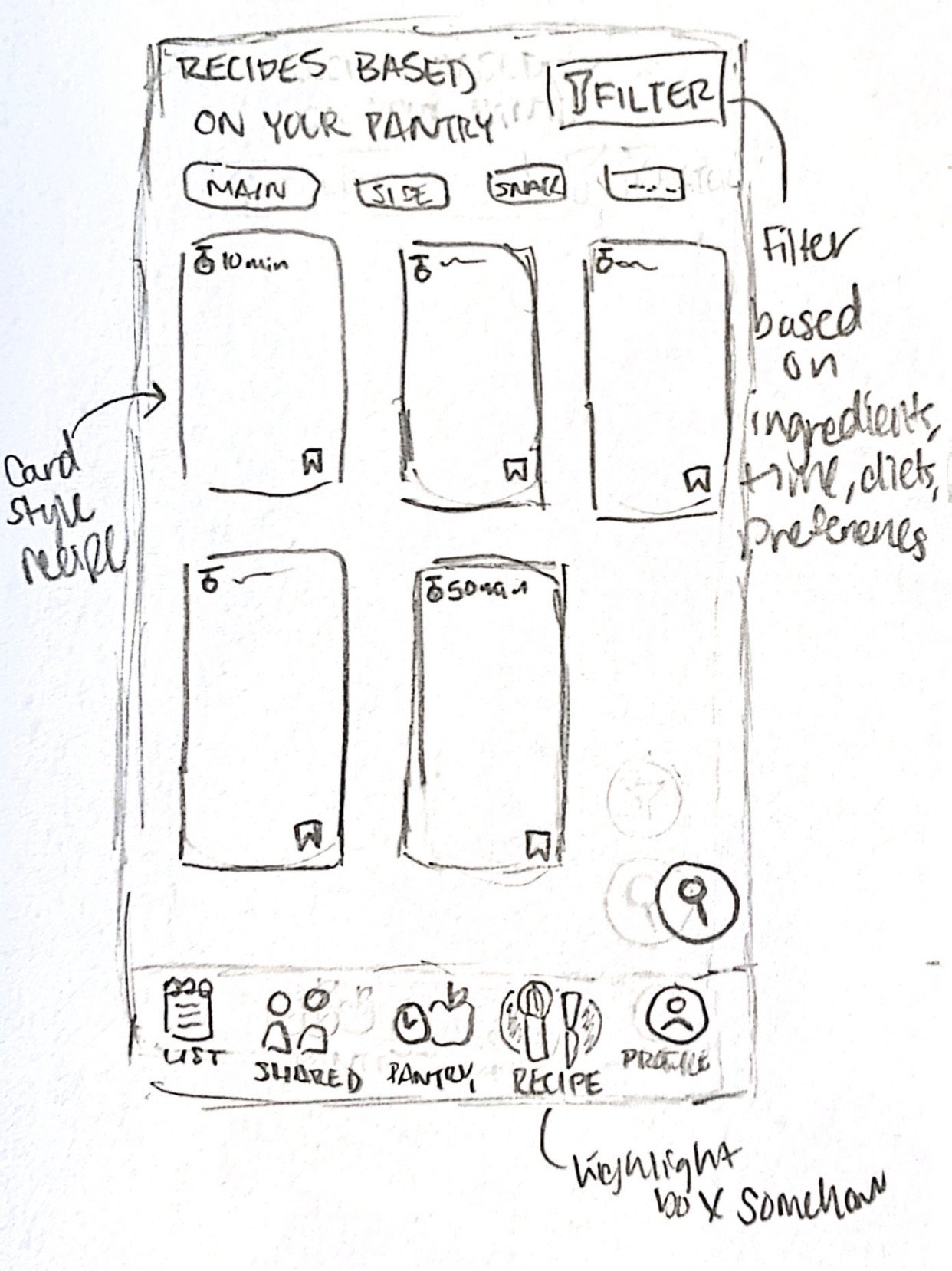
suggested recipes for expiring foods
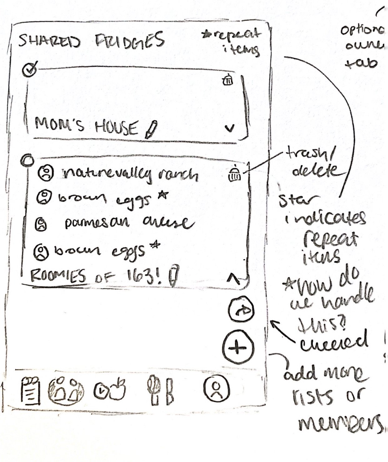
the ability to manage multiple households & shopping lists
User Personas
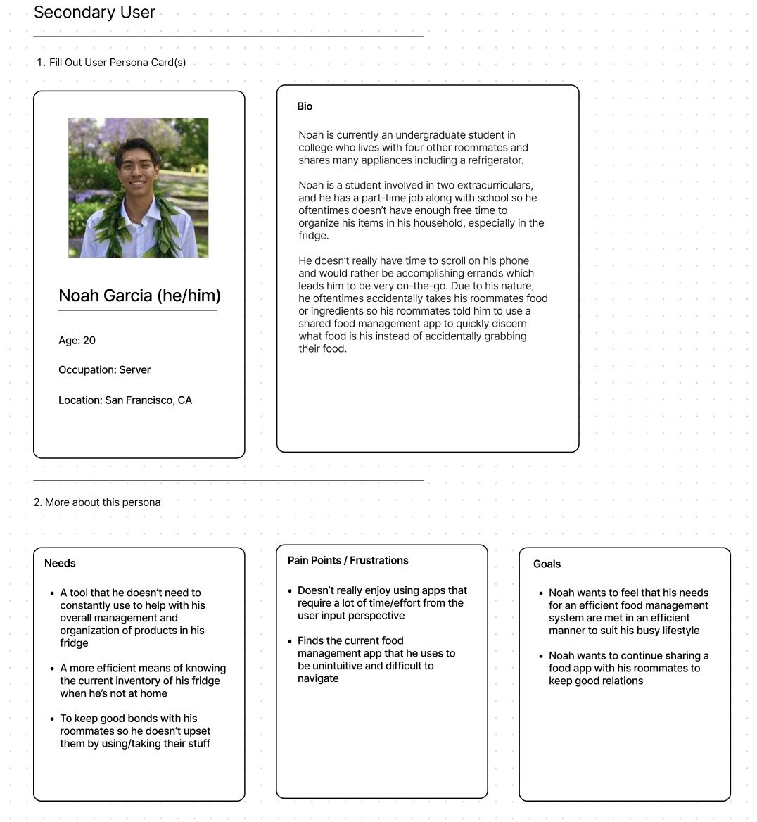
Using survey findings, our team developed a set of primary and secondary user personas to represent the range of households our app would serve. My persona, Noah, is a college student navigating a shared living situation — his needs around fridge transparency, low-maintenance tracking, and roommate boundaries directly informed our collaborative fridge and custom labeling features, which were translated by these pain points:
A tool that he doesn’t need to manage daily to help with his overall management and organization of products in his fridge
A more efficient means of knowing the current inventory of his fridge when he’s not at home
To keep good bonds with his roommates so he doesn’t upset them by using/taking their stuff without knowing what products belong to who
Competitive Analysis
To identify gaps in the existing market, each team member conducted a hands-on audit of competitor apps surfaced through our survey. My analysis of CookList revealed strengths in basic inventory and reminders, but notable gaps in customized labeling, multi-fridge support, and receipt scanning — all of which became differentiating features in CoolCrate.

Sketches
With a clear picture of user needs and market gaps, we moved into sketching. I created initial concepts for all five navigation screens — pantry, recipes, shared fridge, shopping list, and profile. From there, we divided hi-fidelity ownership based on which sketches best fit each feature's requirements, in which I took ownership of the pantry feature which logged all of the user’s current perishable food products.
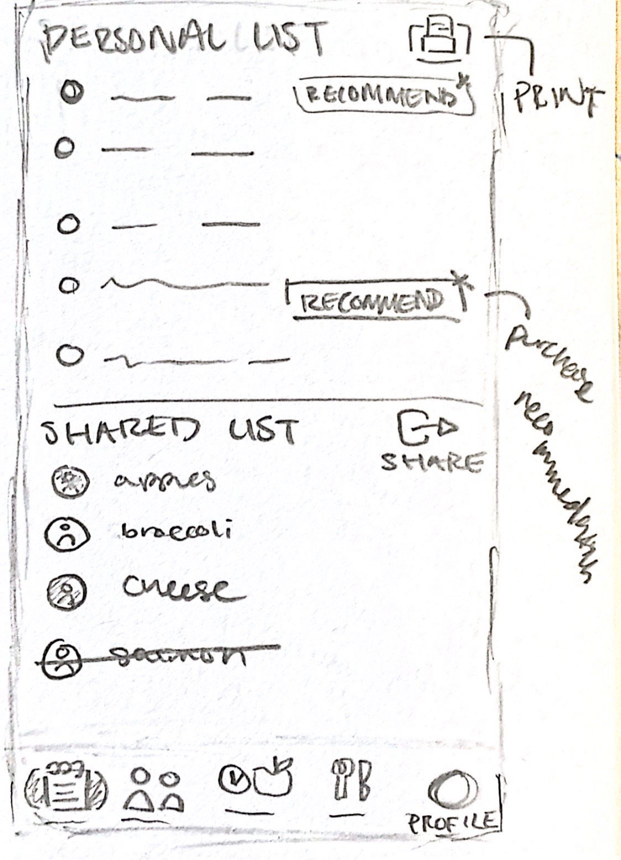
Lo-Fidelity Wireframes
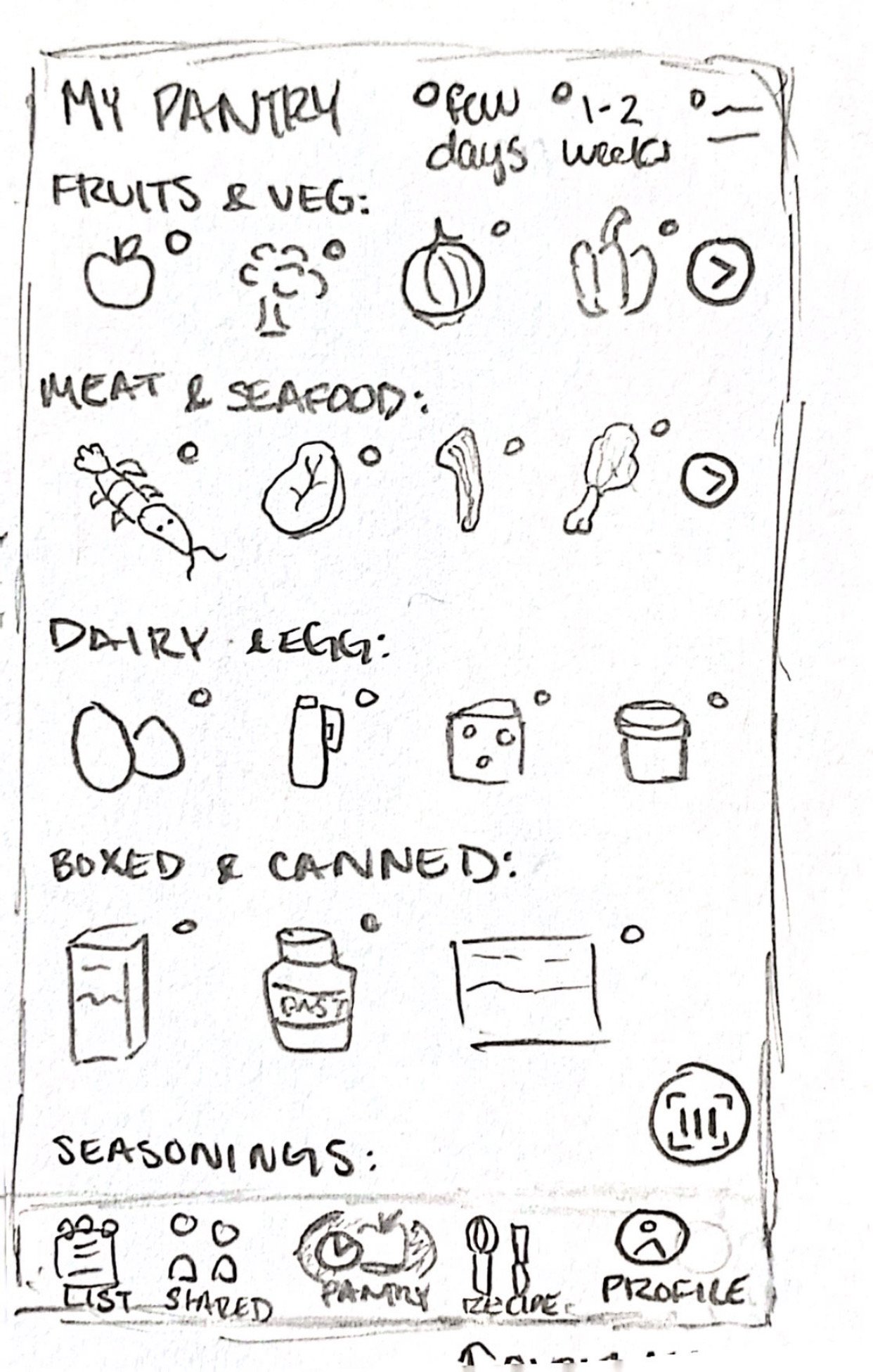
Through two rounds of group critique and iteration, I refined my lo-fidelity wireframes significantly from the initial sketches. Key additions included a search and delete function, expiration filtering by food type and urgency, shared ownership indicators for household items, and an individual view for single-occupant users.


Styling Guidelines
I developed the team's styling guidelines to establish visual consistency across all screens. The warm color palette was chosen to feel approachable and food-forward, with Olivine Green as an accent to ground the design. The fridge logo reinforces the app's core purpose at a glance.

Hi-Fidelity Wireframes
In moving from mid to high fidelity, I focused on readability and clarity — adding product labels, applying the full color system, and refining button placement based on usability principles. I introduced color-coded expiration labels with "E" and "U" indicators so users can instantly distinguish expiring items from use-by items without reading fine print.


Usability Testing
Once prototyped, I conducted a moderated usability test with a participant matching our target demographic. Using a think-aloud protocol over Zoom, I observed how they navigated through my pantry screens and collected live feedback on their experience. The session surfaced a legibility issue with certain text sizes, which I resolved in the final iteration — confirming the core navigation and feature structure felt intuitive and low-effort to use.


Future Improvements & Reflections
CoolCrate gave me my first experience leading a design team through a full product cycle. Key takeaways I carry forward: investing more time upfront in team alignment reduces friction during execution, and leaving room between fidelity stages allows for more meaningful iteration. Given more time, I'd expand the feature set to include coupon and discount integration, and conduct additional usability rounds with a broader participant pool.
3D graphics created by @nabeeel.design 🥕